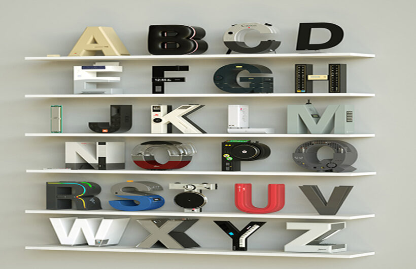
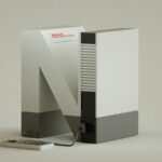
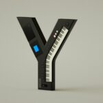
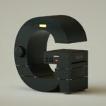
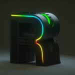
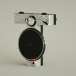
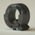
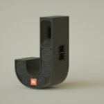
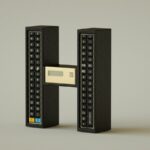
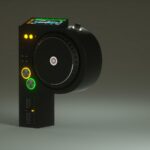
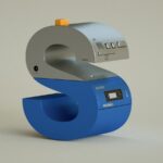
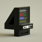
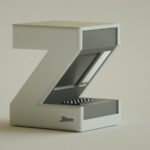
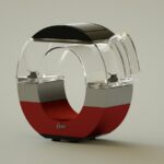
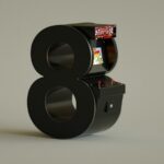
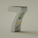
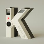
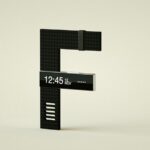
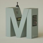
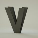
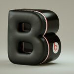
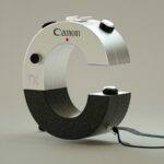
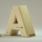
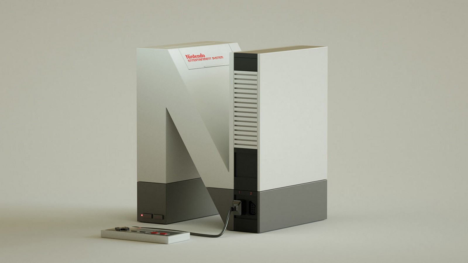
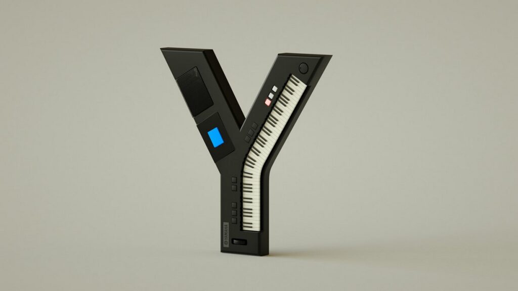
Vinicius Araújo, a talented graphic designer hailing from Rio de Janeiro, Brazil, has unveiled a remarkable project titled “36days Electronics.” This ingenious endeavor showcases a comprehensive collection of Helvetica letterforms inspired by both contemporary and retro electronic brands. From iconic names like Apple (A) to cutting-edge companies such as Ultimate Ears (U) and Nintendo (N), Araújo’s project offers a captivating fusion of typography and technology.
The Concept Behind “36days Electronics”
At the heart of “36days Electronics” lies Araújo’s passion for both graphic design and technology. By seamlessly integrating the aesthetics of electronic brands into the timeless Helvetica typeface, he creates a visually striking alphabet that pays homage to the ever-evolving world of electronics. Each letter is meticulously crafted to reflect the essence and identity of its respective brand, resulting in a cohesive and captivating collection.
Beyond Letters: Exploring the Bonus Set of Numbers
In addition to the alphabet, Araújo treats viewers to a bonus set of numbers, further expanding the scope of his project. These numerals, adorned with elements reminiscent of electronic design motifs, complement the alphabet seamlessly, offering a comprehensive typographic journey through the realm of electronics.
Conclusion
In conclusion, Vinicius Araújo’s “36days Electronics” project stands as a testament to the creative synergy between typography and technology. Through his meticulous craftsmanship and innovative design approach, Araújo showcases the enduring influence of electronic brands on contemporary visual culture. As viewers immerse themselves in this captivating alphabet and bonus set of numbers, they are invited to appreciate the intersection of design and technology in a truly unique and inspiring way.
